
UNDER CONSTRUCTION
Experience Packaging is the core of your brand…the tangible expression of your product and brand values. Packaging is also paid for advertising space that when used effectively can capture consumer attention in crowded retail environments within a matter of seconds. With over 25 years of experience, Taste Branding & Packaging has gained substantial insight and knowledge of the food and beverage industry in the ingredient, foodservice, and retail CPG sales channels. We’ve developed brand identities and logos, product names, product packaging, labels, display packaging, and shippers. We’ve provided food and beverage photography, food styling, and digital photo editing services to make our clients’ products look appealing and irresistible. We’ve also developed POS and POP materials and campaigns that successfully position and market our clients’ products and brands. For more information on our services and capabilities, go to our Services page. Approach Taste utilizes a proven creative development process for strategic branding and packaging design. Creative direction is driven by product category knowledge, competitive set analysis, and relevant strategic marketing data to help ensure that branding and packaging project objectives are successfully met. For more information, please contact us. Clients We invest in our client partnerships by gaining a thorough understanding of our clients’ products, competitive advantages, and sales channels. Whether we are retained on a per-project or annual contract basis, we are committed to developing long-term, mutually beneficial partnerships with all of our clients. We have served many clients in the ingredient, foodservice, and retail CPG sales channels including bakery, seafood, produce, deli, dessert, beverages, dairy, frozen, refrigerated, organic, natural, and many other product categories. For more information or to request a client list, please contact us.
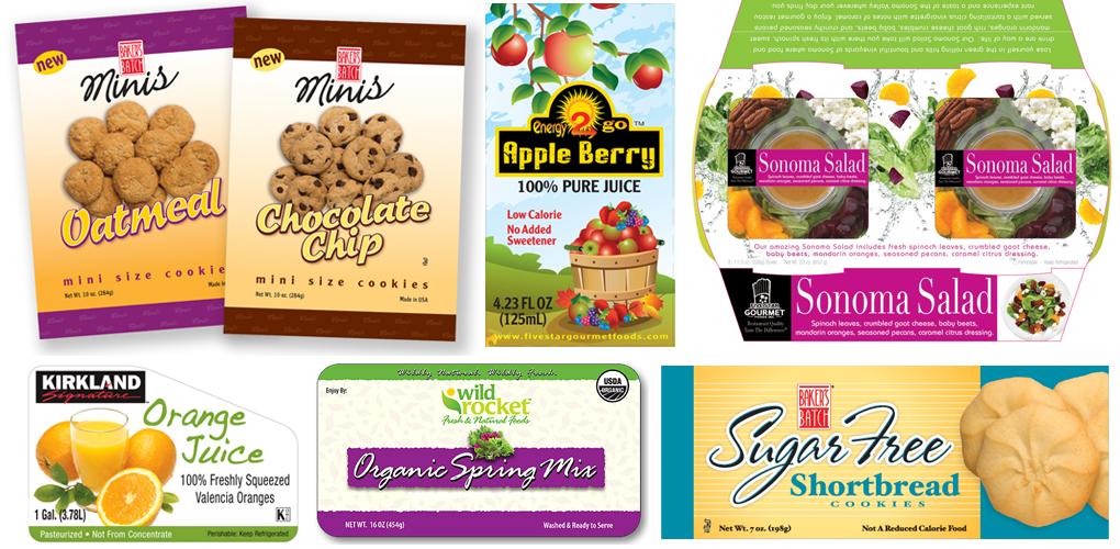
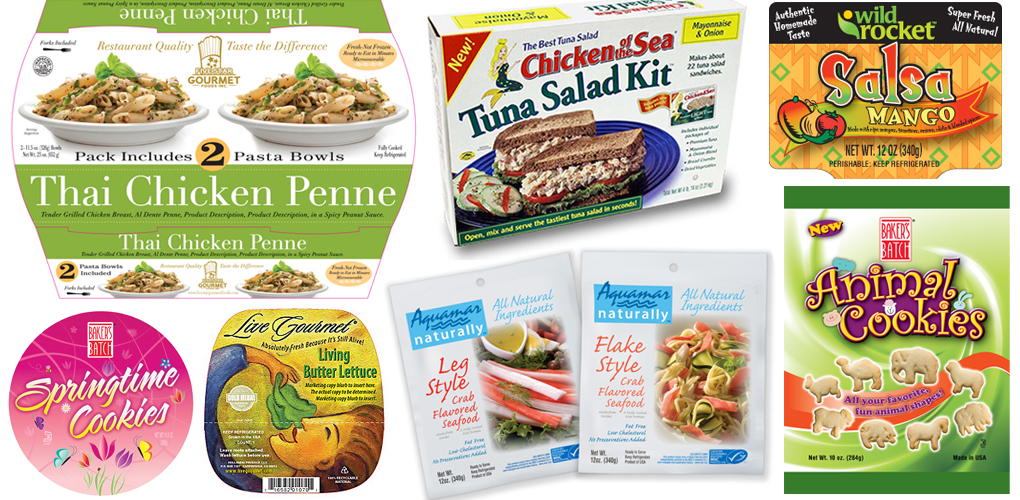
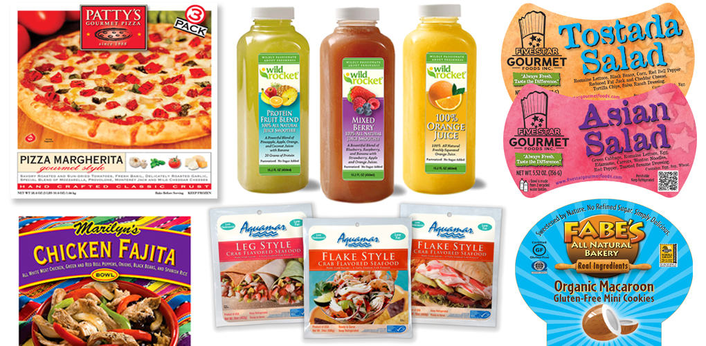
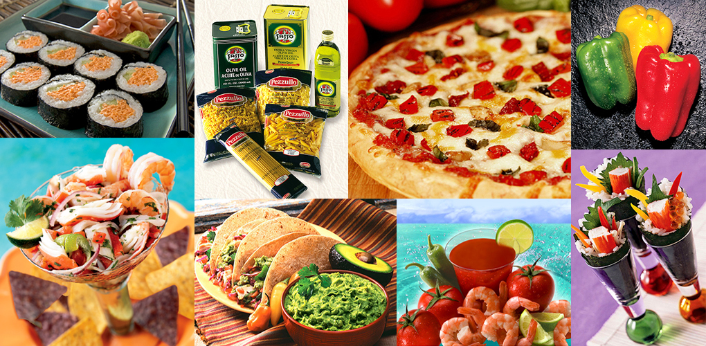
Brand Name & Logo Development The foundation of all successful food and beverage products rests with the power of their brands.We develop food and beverage brand names and logos that are creative, unique, and communicate consistent brand imaging and messaging. We also provide brand name and logo update services to refresh existing brand names and logo identities to give them more relevance and enhance their effectiveness. For more information, please contact us. See project examples. Food & Beverage Packaging/Label Design Well designed food and beverage packaging and labels, particularly for retail CPG, are essential in capturing consumer attention in the visually cluttered retail environment. From creating the graphics and copy, to assistance in selecting the most appropriate packaging and label materials and configurations, we provide a total solution for innovative, effective food and beverage packaging and labels. We also provide packaging and label updating services to refresh existing packaging graphics, add new or revised information, and enhance the effectiveness of packaging as a branding and marketing tool. For more information, please contact us. See project examples. Food & Beverage Photography Whether it’s a food product photo or highly stylized serving suggestions, excellent photography is essential in conveying the quality, appeal, and applications of food and beverage products. Our team includes photographers who specialize in food photography, have fully equipped in-studio kitchens for food preparation, and complete in-studio digital photo support services. We also provide set design, food styling, food photography planning and art direction, and digital photo editing services. In addition to our custom photography services, we can also provide both royalty-free and rights-managed/protected stock photos from our own archive library of stock images and other online resources. For more information, please contact us. See project examples. POS & POP Materials/Campaign Development Point-of-sale (POS) materials help food and beverage category buyers evaluate manufacturers, suppliers, and product lines. Category buyers and retailers rely on producers and suppliers to support their food and beverage retail products with effective point-of-purchase (POP) materials and campaigns. We develop food and beverage POS and POP including sales sheets, product specification sheets, and POP displays and campaign components that effectively support branding strategies and marketing messages. For more information, please contact us. See project examples. Branding & Packaging Consultation Over time, some food and beverage brand identities and packaging may begin to lose their luster, relevance, and effectiveness. And, some packaging may need to be updated to meet current FDA/USDA regulations. An assessment of branding and packaging relevance, positioning, and messaging can often bring insights and direction on refreshing them. From competitive set analysis, visual appeal, positioning, key messaging points, and relevance to the target market, to examining existing brand logos, packaging graphics, content, and configuration, Taste offers an array of branding, logo identity, and packaging design assessment and consultation services to help re-establish brands, logo identities, and packaging for continued growth and success. For more information, please contact us. Marketing Support In addition to our branding and packaging services, we provide a wide range of marketing solutions by offering the following support services: Website Development Email, Social Media, Online Advertising Advertising & Marketing Campaigns Tradeshow Exhibit Design, Promotional Materials & Campaign Development Copywriting & Press Release Development Media Planning & Procurement For more information on these and other marketing support services, visit our other website at: www.TasteAds.com
UNDER CONSTRUCTION
Taste Branding & Packaging78206 Varner Rd., Suite D #111Palm Desert, CA 92211p: 760-200-0730Email: If you'd like to contact us via email, please complete and submit the form below.This will allow us to better respond to your inquiry and help minimize spam. Thank you. * indicates required field First Name:* Last Name:* Email Address:* Re-enter Email Address:* Subject:* Message: Your Title: Company Name:* Phone: Address:* City:* State:* Zip Code:* Website Address/URL: I'm interested in (check all that apply): Free Phone Consultation and/or Estimate Brand Name and/or Logo Development Packaging/Label Design Photography Print Marketing/Sales Materials Development Tradeshow Exhibit Design and/or Promotional Materials New Website Development or Update of Existing Website Other: How did you hear about us? (online search, e-mailer, social media, referral, other?) Please check box if you would like to subscribe to our free e-mailers. CAPTCHA Code: Please type in letters/numbers shown above in field below.*
Food Packaging & Printing Glossary Listed below are brief definitions of terms commonly used in the packaging and printing industries. 2P: Aluminum cans are 2P (two piece) cans, comprising a top and body. The body is formed from a sheet of aluminum and drawn to the required height, decorated in the round (up to six colors) and coated internally. The customer adds the top (second piece) after filling. 3P: Steel cans are 3P (three-piece) cans comprising a top, a body and an end (base). The body is formed into a cylinder from a sheet of pre-printed or plain tin-coated steel and the end is seamed to it prior to delivery to the filler. The customer adds the top (third piece) after filling. Absorbent Packing: Material within a package which absorbs liquids from product, i.e. pad in meat trays is made from paper and has a plastic liner. Aseptic Packaging: A technique for creating a shelf-stable container by placing a commercially sterile product into a commercially sterile container in a commercially sterile environment. The sealed container is designed to maintain product sterility until the seal is broken. Anilox: An ink roller used to control the amount of ink transferred onto substrate during line screen printing. Anilox rollers are often referred to by the number of lines, or divots, on the roll. Higher line counts mean smaller divots, which transfer less ink onto the substrate. Back Seams/Seals: A seal in a bag which runs down the middle of the back, in machine direction. Many back seams such as fin seals and lap seals are made by form fill and seal machines. Fin seals are created when the inside edges of the substrate are bonded, leaving the seam standing out from the package, such as on potato chip bags. Lap seals are made when two layers of substrate overlap, forming a bond with no material standing out from the package. Bacon Wrapper Paper: A glassine, greaseproof, or vegetable parchment paper, or a laminated product made from these papers and other materials, used for wrapping bacon. Blister Packaging: The item is secured between a preformed, usually transparent plastic, dome or bubble and a paperboard surface or carrier; also referred to as a “bubble pack”, i.e. bologna package hanging on a peg in a supermarket’s refrigerated case. Boil-in-bag: A sealed container made of heat-resistant material designed to hold a food product and permit the ultimate user to bring the bag and product to boiling temperature in preparation for eating before the product is removed from the bag, i.e. frozen entrees or vegetables. Breathing/Breathable Package: Packaging material made in such a manner that air may enter or leave under varying conditions, including temperature changes, with or without a drying agent to remove moisture from entering the package. Most wrap used for fresh red meat allows enough air to pass through to keep the proper color in the meat. Blow Molding: Formation of a bottle from a molten plastic tube by blowing air into the mass, forcing the material to follow the shape of the mold. Bond Strength/Seal Strength: A lamination term referring to the integrity of a connection between 2 or 3 materials glued together. Also known as a “destruct bond” where the strength means the materials will break before the seam does. Bottom Seal: A bond between two layers of polyethylene made by a heated bar (element) which does not separate the bag from the roll. The placement of this seal is determined by the machine and printing direction. Bottom sealed bags are separated by a guillotine type knife which leaves one half inch of unsealed material at the bottom of the bag. Broke: Paper trimmings, paper damaged due to breaks on a paper machine or not manufactured to the required quality specification. Broke is usually fed back into the paper manufacturing process. Can: A receptacle generally having less than 10 gallon capacity, consumer or institutional sizes; also means to pack a product in a can or a wide-mouth glass container for processing, shipping or storage. CAP (Controlled Atmosphere Packaging): A packaging method in which selected atmospheric concentrations of gases are maintained throughout storage in order to extend product shelf life. Gas may either be evacuated or introduced to achieve the desired atmosphere. Normally used for fruits and vegetables, not meat products. Cardboard: Term erroneously used for “paperboard”, it is a stiff, moderately thick paperboard, heavier than paper, i.e. used for frozen entrees. Carton Dimensions: Dimensions refer to the interior of a carton, measured in millimeters of Length x Width x Height. Length (L) is the longer side of the opening and Width (W) is the shorter. Height (H) is the length between the openings on either end. Cellulose: The main fibrous material in paper. CPET (Crystallized Polyethylene Terephthalate): A heat-tolerant plastic that can be molded into multi-compartment and single frozen food containers; can be heated in the microwave or conventional oven. Closures: Closures are caps or lids used to seal beer, soft drink bottles, food jars, and cans. Closures are made from plastic, steel or aluminum and can be screw, twist or pop-up style. Another type of closure is a plastic seal, which is used to reseal a metal can after opening. ‘Closures’ also refers to machinery used to apply the closures to containers after they are filled. Composite Cans: Cans made from paperboard. A variety of barrier materials and fittings enable composite cans to be used for packaging food, powdered beverages, wine, spirits, and perfume. Core: The paper core, with a diameter between 3 and 6 inches, on which bags or packaging material is wound during manufacture. Corrugated Fiberboard: This material refers to the composite structure formed by gluing one or more sheets of fluted, corrugated material to one or more flat facings of linerboard. Single-wall carton: This is a corrugated fiberboard carton made by gluing a sheet of fluted corrugated material between two flat sheets of linerboard. Double-wall carton: This is a corrugated fiberboard carton made of three sheets of linerboard interleaved with two sheets of fluted corrugated material. Crimp Seal: A sealing process which uses scribed heating elements to bond substrates, such as the end seals of potato chip bags. Cylinder: The machined rollers on which printing plates are mounted for use in a CMF printing press. Delicatessen Paper: Used as an inner wrap for meats and for soft foods to retain the moisture in the food and to prevent the outer wrapper from becoming water- or grease-soaked; made from bleached chemical wood pulp and may be given a dry paraffin wax treatment of about 10 to 20 percent of the weight of the paper. Die Cutting: The process of cutting a corrugated sheet into a shape which will convert to the required box size when assembled. A rotary die cutter uses a cylindrical die and is generally capable of higher speed than a flatbed die cutter, as the sheet flow basically continues. A flatbed die cutter uses a flat die and the corrugated sheet momentarily stops to enable the required cutting. This method provides both high accuracy and intricate shapes not available from the rotary process. Double-facer: A double-facer, or double-backer, is the part of a corrugator which bonds single-face board to another liner to produce a double-faced corrugated sheet. Eyemark: These small, black lines are usually made on the edge of the substrate, repeating throughout the length of the roll precisely in the same spot in relation to the printed design. Eyemarks are detected by a photocell on the machine, to indicate when a task is required. Eyemark placement must be consistent for processing machines to produce the best results. Fiberboard Can: A rigid container constructed almost completely of lightweight fiber stock; may be lined, treated or coated; ends of can may be made of paperboard or metal, composite can, i.e. packaging used for juice concentrates, potato sticks and onion rings. Flavor and Aroma Barrier: The ability of a substrate material to act as a barrier to flavor and aromas, often linked to its OTR (Oxygen Transfer Rate). Flute or Corrugation: This refers to the wave shapes, or ridges, that are pressed into a sheet of material that has been softened by steam. This material is then sandwiched between flat sheets of material to form corrugated fiberboard. Flute serves as protective cushioning and helps strengthen a carton. Different widths and configurations offer distinctive performance advantages. Corrugated cartons feature either of the types below. A-Flute: Flute thickness of 4.7 mm B-Flute: Flute thickness of 2.5 mm C-Flute: Flute thickness of 3.6 mm Depending upon the stacking strength, puncture resistance, or crush strength required for the carton, one of the above three commonly corrugations are used in single-wall, general-purpose cartons. A-Flute has excellent stacking Strength, B-Flute has good puncture resistance, and C-Flute has the optimum combination of both. E-Flute: Flute thickness of 1.5 mm, it is generally used for light applications, i.e. pizza boxes, mailers, and shoe boxes. BC Flute: This flute is a double-wall combination made from one B-flute, single-wall sheet and one C-flute, single-wall sheet. The result is a strong corrugation used when extra thickness or stacking strength is needed. AC Flute: This flute is a double-wall combination made from one A-flute, single-wall sheet and one C-flute, single-wall sheet. The result is a very strong corrugation used when extra strength is needed. Flexible Packaging: Bags, envelopes, pouches or wraps which can be changed in shape or bent manually; made of materials such as paper, plastic film, foils, etc., or combinations of them. This covers a wide range of packaging that can be single and multi-layered, and is supplied in reels or bags. It can be paper, poly, foil, or nylon, or a combination of materials which are supplied either plain, printed, coated, and/or laminated to provide long shelf-life properties. End products packaged include confectionery, snack foods, frozen foods, soups and pharmaceuticals. Foam Trays and Other Foam Shapes: Made from EPS (expanded polystyrene); formed when foaming agents are added to polystyrene and passed through a die, i.e. trays for fresh meat and egg cartons. Styrofoam™ is an insulation used in building materials and is not used in packaging. Folding Cartons: Multi-layer paperboard cartons which are printed/coated and cut into carton blanks. The carton blanks also incorporate creases, which enable the carton to be formed for packaging products. Form Fill and Seal Machine: Machines usually purchased by food producers to facilitate product packaging by creating packages and filling them with product in one step. FFS machines can be oriented either vertically (VFFS) or horizontally (HFFS). Vertical machines form and cut packages, to be filled with product dropped into the package before final sealing. Horizontal machines are used in cases where dropping a product vertically may cause damage (such as pastries, chocolate bars and cookies) and instead, the product is placed into the package horizontally. Frozen Foods Paper: A type of high moisture and water vapor resistant paper used for inner liners in frozen food packaging, usually specially treated glassine or bleached chemical wood papers, waxed papers, or plain or coated vegetable parchment paper; pliable and strong to resist cracking at freezing temperatures and for high wet strength. Functional Coatings: The lamination of polyethylene, plastic, or foil films to paper substrates, providing a water or greaseproof barrier. Typically used in high humidity applications in both tropical and cold temperatures, for use with meat, seafood, pet food, fruit, and produce. Gas Flush: A procedure used in food packaging where gas is used during the packing process to evacuate oxygen and moisture before the package is sealed. Gauge – Mil: Interchangeable terms referring to the thickness of a substrate material. Glassine: Smooth, dense, transparent or semi-transparent paper manufactured primarily from chemical wood pulps; is grease resistant and has a high resistance to the passage of air. It may be waxed, lacquered, or laminated to be impervious to the transmission of moisture vapor, and can be white and other colors. Gravure Printing: This printing medium is the transfer of ink from an etched cylinder, such as a sunken surface, to the substrate, eg. Paper, film, or foil. The equipment is a multi-station printing machine to print and/or coat multiple colors/coatings, typically up to eight colors/coatings, on to a fast-moving web of material. HDPE: High-density polyethylene. Injection Molding: The process of converting plastic pellets by using heat and pressure to inject the molten material into a water-cooled mold. The equipment can produce a number of products in the one injection. Impression: This can either refer to the amount of pressure used to place ink on a substrate or, more commonly, the measurement of the overall area used to print a design on a substrate. Kraft: This term describes the natural, unbleached corrugated fiberboard used in making cartons. LBS/M or LBS Per Thousand: Describes the weight of material used to make 1000 impressions on a given material. LDPE: Low density polyethylene. Linerboards: Linerboards form the inner and outer facings of corrugated fiber boxes and are chosen for their structural and/or decorative properties. They can be made from white or brown, Kraft or recycled fibers, or a blend of both. Line Printing – Spot Printing: Image printing using a set of premixed inks for each color required in the design. This is also referred to as screened print. Line Screen: A count used to describe the concentration of dots in an image over a specific area, such as DPI (dots per inch). A higher line screen count results in a higher quality image. Lineal Ft.: Refers to the number of feet unwound from a roll of substrate, measured along the length of the unrolled material. Machine Direction: Describes the direction a film travels through a machine during processing, often used to decide the direction an image is printed on the film, and where cuts and seals are to be made. MAP (Modified Atmosphere Packaging): A packaging method in which a combination of gases such as oxygen, carbon dioxide, and nitrogen are introduced into the package at the time of closure, the purpose of which is to extend shelf-life of the packaged product , i.e. lunch meat in a blister package. Meat Wrapping Paper: A specially treated odorless and tasteless paper that resists meat juices, fat, and grease, and is easy to remove from any kind of meat. Mechanical Pulp: Pulp produced by reducing pulpwood logs and chips into their fiber components by the use of mechanical energy, via grinding stones or refiners. Metal Can: A rigid metal container made of steel sheet or plate, 27-gauge or less in thickness, or a similar container made of aluminum, copper, or other metal, i.e. food cans. Metalising: Applying, through a vacuum process, a thin aluminum layer onto flexible plastic film substrates used to package a variety of foods. Migration: Transfer of a component of a packaging material into the product contained, or loss of a component of the product into the packaging material. Netting (Plastic): Continuous extruded net of flexible plastic material, most commonly polyethylene, which can be made into bags, sleeves, or wraps, i.e. net over a frozen turkey package. Nylon: Nylon is a versatile family of thermoplastic resins that vary from relatively flexible products to tough, strong and stiff materials; resistant to oils and greases; widely used for meat and cheese packaging, for boil-in-bags and pouches. OD (Outer Dimension), ID (Inner Dimension): Terms often used to describe either the size of a roll’s core, or the size of the complete roll. ID commonly refers to the inside measurement of a package, either with or without the width of the seals included. Offset/Lithographic Printing: This printing medium is the transfer of ink from a sensitized plate, offset to a rubber blanket and then transferred to the substrate. The equipment is a multi-station, typically up to eight, printing machine to print and/or coat up to six colors on to sheets or a fast-moving web. OPP, BOPP, CPP: OPP (Oriented Polypropylene): A term used to describe polypropylene which is stretched in machine direction, creating properties desirable in certain food processing situations. BOPP (Biaxially Oriented Polypropylene): Material which has been stretched in both machine and transverse direction, creating properties desirable in certain food processing situations. CPP (Cast Polypropylene): Inexpensive, un-stretched material with very limited barrier qualities, not often used for food packaging. OTR (Oxygen Transfer Rate): Describes a material’s barrier abilities against oxygen. This is particularly important to food packaging, as oxygen can damage oil and far molecules, decreasing shelf life of a product. Ovenable Board: A paperboard that can be placed in an oven, microwave or conventional, to serve as the cooking vessel for food, typically a solid, bleached sulphate board coated with polyester terephthalate, i.e. frozen entrees. Pasting: Two, three or four plies of paper and paperboard are glued together to form a solid fiberboard with a thickness ranging between 0.8mm to 3mm. The boards are used for a variety of applications such as shoe boxes, screen printing, display boxes, board games, book covers, and ring binders. PE: Polyethylene, a low cost soft flexible material often used as an outer wrap. PE is also used as a sealant layer for laminates, due to its ability to create hermetic seals. PET: Any substrate made of polyester, without coatings. PET, Coated: Polyester substrate coated with PVDC to increase the film’s resistance to oxygen and moisture. PET, Met Pet: Polyester substrate coated with aluminum on one site. In addition to oxygen and moisture barrier, this coating provides protection against UV (ultraviolet) light, which can damage oil or fat molecules. Met Pet is commonly used in food packaging. Plasticizer: Material added during the manufacturing process to increase flexibility; for example, the plasticizer ATBC (acetyl tributyl citrate), used in such DowBrands™ as Saran™ and Handiwrap™, is made from citric acid which is commonly present in citrus fruit. Polyester, Thermoset: Filled plastic which is heated to harden into a shape and does not soften when heated during normal cooking temperatures, i.e. plastic dishes in frozen dinner entrees which can be heated in the microwave or conventional oven. Polyethylene Film: The most used transparent flexible packaging material made from polyethylene, a synthetic clear compound formed by subjecting ethylene, a gas found in coal, to pressure. It is low cost, transparent, tough, heat sealable, moisture-proof, and resistant to low temperatures. Polypropylene: A synthetic resin plastic packaging material used for microwave-only heating of foods with low fat and sugar content; not heat stable for use in conventional ovens. Polyvinylidene Chloride: A thermoplastic polymer which can withstand higher temperatures than polyethylene, especially useful for covering cooking vessels when microwaving foods, moisture-proof and transparent, ie. Saran Wrap™. Process Printing: A type of printing used to create photographic quality images by combining four primary inks: Cyan, Magenta, Yellow and Black. Also known as CMYK printing. Pulp: Primary raw material from which paper is made. A fibrous product produced by mechanical or chemical processes, or a combination of both. PVC (Polyvinyl Chloride): Replaced cellophane as the preferred meat wrapping used in supermarkets, a member of the vinyl family made from a compound found in petroleum. Low cost, it protects against moisture loss, but has some oxygen permeability so it allows meat to bloom or maintain a red, fresh look. RSC: RSC (Regular Slotted Carton) is the most commonly used style of carton. One side is glued, taped, or stapled during manufacturing, making this carton well suited for easy set-up, filling, and closure. Retort Packaging: A flexible container typically formed from aluminum foil and plastic laminants. Can withstand in-package sterilization of the product, and, like metal food cans, can provide a shelf-stable package for foods. It allows for cooking food in the package , i.e. baby food or soups that have meat or vegetables that need to cook at a specified temperature to kill any micro-organisms to avoid botulism. Repeat: A printing term referring to the total distance of one printed impression. This measurement is commonly used to determine the size of printing cylinder required to print the image. Rigid Plastic Packaging: Freestanding plastic bottles and plastic fittings. The main raw materials used are PET, HDPE and PP. Roll Flags: Flags are used to indicate a splice or an area of misprinted images on a roll. These tell processors where to take action to ensure smooth processing. Some machines will remove misprinted images from a roll, creating a splice and adding a flag. Roll Geometry: The straightness of the edge of a roll of substrate is very important. Processing material through a machine can prove a challenge if the roll moves out of line with the machine feeds. Sheet Feeder: A corrugating plant that has no converting equipment and produces only corrugated sheet. Its customers are typically independent sheet plants. The term ‘sheet feeder’ can also mean the device at the front of die cutters/flexo folder gluers. Shelf-life: Refers most often to food products where the effective life of the product from the date of packaging is limited. Products beyond their effective date must be removed from inventory shelves because they are expected to be stale. Shrink Wrapping: Plastic film that shrinks when heated, producing a tight, neat fit. The most popular form of grocery store meat packaging is PVC wrapping with foam trays. Side Weld: A process used specifically on polyethylene bags where two substrates are bonded together and separated from the web at the same time by a tapered hot element commonly referred to as a knife. Single-facer: The section of a corrugator which forms the corrugated shape in the medium, applies adhesive to it and then bonds it to the flat linerboard. The output from a single-facer is referred to as single- face board. Most corrugators have more than one single-facer to enable different flute sizes to be used. Slitting/Slitter: A machine used to divide single, large rolls of web into smaller rolls. This is achieved by passing the entire web across cutting knives as it is removed from the larger roll. The divided webs are then rolled onto new, smaller cores. The same process is used to remove excess web from printed output rolls. Splice/Butt Splice: Rolls of printed product often contain joins where two rolls have been fused, or misprints have been removed. Typical industry protocol limits the number of splices in a single roll as they can cause waste or slow down operations. Any splices in a roll should be flagged for easy identification. Substrate/Film: Any base material, polyethylene, polypropylene or other material, used to make a packaging product. Thermoforming: The process of shaping a plastic sheet of styrene or PVC under heat and pressure. Three Side Seal Pouch: Any bag which has been heat sealed on 3 edges. Transverse Direction: Opposite of machine direction, 90 degrees to the direction a film travels through a machine during processing, often used to decide the direction an image is printed on the film, and where cuts and seals are to be made. Treated: Substrate which is to be printed on must be treated on the printing side by the substrate supplier. The opposite side of the substrate is not printed. Vacuum Packaging: Rigid or flexible containers from which substantially all air has been removed before sealing. Carbon dioxide or nitrogen may be introduced into the container. This process prolongs shelf-life, preserves the flavors and retards bacterial growth. WVTR (Water Vapor Transfer Rate), MVTR (Moisture Vapor Transfer Rate): Describes a material’s ability to repel vapor, which can damage the shelf life of certain products.
Brand logos broadcast a unique, memorable, and clear message about the products and services they visually represent. For food marketers, a brand logo can have a long shelf life, but as trends and markets change, it may become necessary to make adjustments. The question is: what kind of adjustments? Since there has been an investment in branding over time, the value of an established brand logo can become considerable. There may be many reasons to consider only minor changes to an otherwise serviceable brand logo such as refreshing the look to reflect current trends. There may also be many reasons to consider a complete logo redesign, such as mergers, acquisitions, reorganizations, and re-direction of product or product category focus. The brand logo change then becomes a decision between brand logo evolution or brand logo revolution. Making any change to a brand logo should be supported by a strategic business objective. This will not only assist in garnering the support of all the various stakeholders, it will also set a clear direction for the creative effort. Making any changes to a brand logo can have both emotional and financial impacts, so it is an effort typically undertaken infrequently, a once-a-decade kind of effort. Here are the degrees of brand logo change to consider, ranging from change, to evolution, to revolution: 1. Change without change. This is akin to getting a haircut without losing any length. The change is subtle, basically leaving the overall design of the brand logo intact and unquestionably recognizable. This effort usually revolves more around the message and design elements that support the logo rather than changes to the logo itself. This strategy works well for established brands with positive images within their market base. It allows the brand logo to remain relevant in a changing marketplace. 2. Brand logo evolution: Many brand logos are continuously tweaked over time to maintain relevance and encompass changes in brand strategies, but the underlying logo mark is not fundamentally changed or lost. Two high profile examples are Nike and Apple, whose products and target audiences are very dynamic. Brand logo evolution is a great strategy for brands that have established themselves as innovators and maintained their positive image over time. 3. Brand logo revolution. As history has shown us time and again, revolution is aimed at total change. For brands, this can be necessitated by major strategic shifts or by market and business events of seismic proportions. These factors can be both internal and external to the organization but the net result can be a brand logo that has completely lost its utility. As the organization redefines itself and its products and services, a brand logo needs to be developed from the ground up. In recent times, some industries have been more effected than others, such as healthcare, airlines, and financial services, and we have seen many complete re -branding efforts. If you’re uncertain where your brand logo falls on the continuum from change, to evolution, to revolution, ask these questions: 1. Does your brand logo fit with your current business model, as well as your strategic direction for the future? 2. Does your brand logo resonate with your current and projected target market? 3. Does your brand logo convey your brand message in relevant ways? 4. Does your brand logo function and translate well across all media platforms, such as online/digital, broadcast, and print? 5. Does your brand logo clearly differentiate your brand from its competitive set? If the answer to any of these questions is no, it is probably time to consider a brand logo assessment and possible design effort.
Color can have profound effects on consumers, making it an important element in food and beverage packaging design. Research into the effects of color have revealed that consumers subconsciously respond to color with very specific social and cultural messages. Understanding the responses evoked by color can provide insight into which colors may be most appropriate for specific food product packaging. In effectively using color on food product packaging design, the task is to match the brand message, product positioning, and product category with colors that will reinforce product marketing efforts and drive consumer purchase decisions. The flip side is to make certain that consumers are not given miscues through the use of color on food packaging. Here are some cues on color: 1. Blue: Blue is a universally appealing color that studies indicate most people like. It connotes a sense of trustworthiness and dependability. According to a recent Journal of Business study, consumers are 15% more likely to return to stores with a predominately blue color scheme. For example, a blue color scheme for food packaging would be a good choice for products with a positioning statement focused on dependable product performance. 2. Green: The color green has become the poster child for environmentally friendly, natural, organic, and fresh. While it is pervasively used in food product packaging, the color green remains a good choice for products in these categories based on the ingrained connection consumers have with this color. 3. Red: Red is considered the strongest emotive color and marketing experts caution that red acts as an alarm to consumers. On food packaging, red is best used sparingly, primarily to call out specific information in the context of another, less alarming, more soothing color scheme. 4. Yellow: Yellow is a color that evokes high energy. Marketing studies have also found that yellow stimulates appetite, which explains its prevalent use in QSR and fast casual foodservice operations. The use of yellow on food packaging, for example, may be a good choice for snack foods or self-indulgent products such as candy, which are often purchased on impulse. 5. Orange: Research has shown that orange is associated with affordability and fairness in the responses of consumers. Retailers such as Home Depot, whose message is one of value, use orange in their brand identity and throughout their retail environments. Contrast this with Lowes, a Home Depot competitor, whose color scheme is primarily blue and whose positioning is primarily one of trust and dependability. The color orange would be a good choice for food products whose primary message is value and affordability. 6. Purple: Throughout history, purple has been associated with royalty. It evokes in consumers the notion of luxurious and expensive, but probably worth the cost. Purple is widely used for cosmetic and fragrance packaging, at both ends of the price point scale. In food packaging, purple can be seen on chocolate candy and individually wrapped frozen treats packaging, particularly for those brands whose message point is focused on a little self-indulgence. 7. Black: Black is the calling card color for sophistication and luxury. It is commonly seen on high-end cosmetic packaging and is also used by more affordable brands to upscale their position. Black is a strong statement for food packaging and works best for products that are positioned as upscale rather than products positioned for their value proposition. 8. White: Marketing experts affirm that consumers associate the color white with purity and simplicity, as well as honesty and modernity. In food packaging, Pillsbury Simply…Cookies line of refrigerated, ready-to-bake cookies is an example of using primarily white packaging to reinforce the positioning of this product as having a minimal number of ingredients and being quick, easy to bake off. These color cues should not limit creativity in packaging design, but they do serve to remind us of the power of color. The most important take away for food packaging design is that color should be chosen carefully so as not to miscue consumers about the positioning of a product.
In a recent study by global research firm Ipsos Innoquest, consumers indicated that they place a high value on food and beverage packaging that preserves product freshness and is reusable. Over 60% of respondents said they would pay premium prices for products in packaging that “keeps food fresh longer”. Another 50% placed a high value on packaging that is “easy to reuse”. Other recent packaging studies reinforce consumer frustration with food packaging. Almost half of consumers in one such study were “frustrated or very frustrated” with food packaging. Ease of opening packaging was the single biggest complaint. The packaging formats mentioned most often by frustrated consumers included clamshells, paperboard boxes, bags/packets, trays with lids, shrink wrapped, plastic bottles and septic packs/cartons. Another recurring theme voiced by consumers was the need to use some type of tool, knife or scissors, to open packages that already had “easy to open” copy on the package. Ease of opening was an issue for all age segments in this study and not confined to older consumers. User convenience, resealable packaging, and retaining food product freshness are the three most important issues for consumers in evaluating product packaging and purchase decisions. Consumers expressed a great deal of frustration, if not downright hostility, toward brands whose packaging resulted in product waste. Retaining freshness and being able to “use all of the product in the package” were repeatedly mentioned by survey respondents. Clearly, food packaging functionality is a significant factor for consumers when considering product purchases. One frustrating packaging experience can “turn off” consumers no matter how good the product may be. Considering the investment food and beverage marketers make in brand and packaging development, it is critical that packaging configuration, materials, and functionality be included in the design process. Packaging provides food marketers with a great opportunity to communicate with consumers and demonstrate their commitment to consumer satisfaction.
Creating a great new food or beverage brand name and visual identity is so much more than a brainstorming frenzy. It’s a process, that when faithfully adhered to, results in memorable, successful food and beverage brands. Considering the significant resources invested to support a food brand, from developing its visual presence and packaging, to marketing support, advertising, public relations, and a myriad of promotional and image building activities over time, it doesn’t make sense to short-circuit the brand name creative process. Taking these steps will keep the process on track and help ensure a successful outcome: Timeline. Developing a brand name requires adequate time for creative efforts, legal input, and decision maker buy-ins. The process is much easier to manage when everyone has a realistic expectation of the time and effort required before the process begins. A well planned timeline also keeps the process on track by defining milestones and an anticipated completion date. Solid Creative Brief. The best creative efforts are built on a thorough understanding of strategic objectives for the food or beverage brand, the type of name most suitable for the brand, and the criteria for evaluating creative concepts. While there is always a temptation to rush directly into brainstorming, a solid creative brief provides the yardstick by which ideas can be measured in meeting the objectives for the brand. Decision-maker Buy-in. To achieve a successful food or beverage brand development process, it is imperative to identify all of the decision-makers and engage them in the process from the very beginning. Their early input will drive creative efforts in the right direction and will alleviate surprises at the end of the process. Continuous Legal Input. Brand name and visual identity development is as much a legal process as a creative one. Proposed names and decisions on which food product categories are applicable to the brand need to be legally searched for availability. An initial list of proposed names should be submitted to the legal team as early in the process as possible so that unavailable names can be eliminated and alternatives developed. This is a back-and-forth effort between the creative team, the decision-makers, and the legal team, until an acceptable name is agreed upon and cleared legally. Because of the longevity of food and beverage brands, and the resources needed to build them, it can be very short-sighted and expensive not to complete the legal due diligence upfront.
Innovations in packaging materials and configurations, along with creative graphics and messaging, have opened opportunities for food marketers to redefine products and actually invent new product categories. An early example of this trend was the redefinition of baby carrots as a snack food by carrot farmers who began offering them in convenient grab-and-go single serve packaging. Since then, there has been a proliferation of product redefinition through creative packaging and marketing. Paying attention to consumer behavior and interaction with a product can also lead to product redefinition and expanded sales opportunities. Recently, in response to the younger generation that grew up putting ranch dressing on everything from veggies to fries and pizza, Hidden Valley Ranch created Hidden Valley for Everything. The classic ranch dressing was renamed and re-packaged to fit the category definition of condiment. The upside for Hidden Valley Ranch is that their product is now available in an additional in-store category, condiments, where millennials would expect to find it. Rethinking and redesigning packaging can infuse new life into an entire category, influence brand choices, and shape purchasing decisions. Phil Lempert, supermarketguru.com, recently noted that ” 71% of consumers avoid purchase of certain products because of packaging”. He further stated, “69% (of consumers) report a change in shopping habits from a year earlier to favor packaging they believe to be safer”. With a growing array of new packaging materials and technology, many food and beverage marketers are taking advantage of the opportunity to grow sales through packaging redesign. From a marketing perspective, packaging is the one media that brands completely own and control.
For years, food marketers have struggled with this question, particularly for those brands and products that are not owned by Fortune 500 companies with deep pocket ad budgets. The answer can be found on something all food products have in common: packaging. It has been estimated that 40%, and maybe even as high as 70%, of consumers make purchase decisions at the shelf level. They may use a shopping list, but the list is more often category specific, but not brand specific. There are many reasons for this shopping behavior, price point perhaps one of the most obvious. However, the packaging design that jumps off the shelf most often wins, among products within a category. Packaging as advertising levels the playing field among food category competitors because so many consumers make spontaneous, at-the-shelf purchase decisions, irrespective of how much brand advertising they may have been exposed to. The first order of business for food marketers is investing in creative, effective packaging design, but what are the fundamentals of creative, effective packaging design? Differentiation: The appeal of food and beverage packaging in the highly competitive retail environment is visual, and packaging design must visually convey product attributes in a way that differentiates one brand or product over its competitors. Visibility: In the visually cluttered retail grocery environment, packaging must be designed for maximum visibility. Placing branding on all display panels, drawing consumer attention through the effective use of color and images, and other graphic tools that create visual contrast are all strategies used for effective packaging design. Functionality: Consumers want packaging that is easy to handle, resealable for easy use/reuse, and convenient to store at home. Packaging design must not only fit the requirements of the product, it must fit the functionality requirements and expectations of consumers. Shop-ability: Consumers compare brands in a matter of seconds in retail environments and effective packaging design enables consumers to quickly find product claims and attributes. Shop-ability in packaging design means that consumers are able to find key product claims where they expect them to be, and make the product comparisons that are inherent in consumer choice. Messaging: Studies have shown that consumers typically spend five seconds looking at a package…barely enough time to register the branding, product serving suggestion photo, and the most important product attributes. Copy and messaging on effectively designed packaging is more akin to billboard advertising than other forms of advertising…a quick read with a single, clear message.
During the holiday season a couple of years ago, Coca-Cola found out just how iconic its packaging really is when consumers complained about being confused by regular variety Coke holiday packaging. In an effort to support the World Wildlife Fund to celebrate polar bears, the company introduced new white cans for its regular Coke variety for the holidays. The problem? To consumers this holiday promotional packaging design looked very much like Diet Coke’s silver packaging and many consumers bought the wrong product. Other consumers were perplexed because they couldn’t find the Regular Coke red cans. Consumers really do use packaging design as an in-store reference in grabbing the products they want to buy. Comments from Coke loyalists flew fast and furious after the launch of that special holiday packaging design, which should give food and beverage marketers pause. Packaging really is one of the most potent tools for branding and marketing food and beverage products.
Terms & Copyright All content on this website is protected by copyright laws of the United States. Except as specifically permitted, any use, reproduction, display, performance, or transmission of any or all graphics, photos, copy/text, or any other content on this website is prohibited without express written consent of Taste Branding & Packaging. Privacy Policy Taste Branding & Packaging gathers information and maintains permission based data for its own promotional purposes. We do not share or sell any permission based data, including email addresses and contact information, to third party marketing/list companies or any other entities.

Consumers are shopping more for healthy alternatives in the grocery aisles and food packaging can make it easier for them. According to the 19th annual FMI survey “Shopping for Health”, consumers are becoming more informed on eating healthy and they’re reading food packaging for claims that support their health concerns. The top health claims that attract consumers to particular food brands and products are varied. The top concern is heart health (73%) , followed closely by wanting more energy (71%), digestive health concerns (66%) and improving mind/brain function (65%). The more prominent these claims, substantiated by product ingredients, the more that consumers appear to be influenced by on -pack claims. Not that long ago, consumer surveys suggested that food and beverage product choices were being influenced more by claims of what was not in products… sugar -free, no trans or saturated fats, etc. Food and beverage marketers need to pay particular attention to consumers responses to packaging and prominence of product claims. Most consumers indicated that they do read food labels, but that audience share has dropped from 71% in 2007 to 64% in this recent survey. Interestingly, consumers may be reading labels less, but they are buying more food products with certain label/packaging characteristics, primarily what is in the product versus what is not in the product. This proactive approach to food and nutrition is evidenced by what consumers say they are looking for on food packaging: Over 50% claim they are buying more whole-grain products and seek out those on-pack claims. Over 40% are looking for reduced/low sodium products. Low fat (41%) and lower/reduced/zero calories (28%) are the next most sought after claims. All natural is a claim that 28% of consumers are seeking, in spite of the fact that there is no established FDA definition of this claim. Approximately 20% of consumers indicated that they have seen front-of-pack nutrition information. Of the total survey respondents, 61% indicated that front-of-pack nutritional information would be an improvement over such information remaining on the back of packaging. Packaging design has always been an important element in the branding and marketing of food products. These survey results help point food marketers in the right direction in terms of the packaging information that consumers are looking for when they grocery shop and where on packaging they expect to find it.

Food brands are born out of a commitment of resources to create the face of a product. The investment is not just limited to capital in its creation and promotion, it also includes the time needed to build awareness and trust. Without proper care and feeding, food brands can’t serve the purpose for which they were created. Just how should brand owners properly manage their brands to achieve their goals? Here are some important tips for the care and feeding of food brands: 1. Consistency. The best known food brands have spent years building consumer awareness and trust, and this has been achieved by consistency in the presentation and messaging of the brand across all platforms. These brands have a clear definition of their values which enables them to stay on message point whether it’s packaging design, consumer promotional efforts, websites, social media or B2B marketing. There are no mixed messages on these brand faces. 2. Compliance. Part of the investment in developing a brand is developing a set of brand rules that enable all stakeholders to use the brand within the same guidelines. While a brand’s face may be used by many stakeholders for many different purposes, the face must remain the same to preserve the integrity, and in some cases the legal status, of the brand in the long run. 3. Control. This is one of the biggest challenges for food brands today. While brand owners may have achieved consistency in brand presentation and compliance among stakeholders in brand use, control of external brand use and exposure is extremely difficult in the digital environment. Brand owners need to establish procedures for brand management that include a dedicated team to monitor and immediately respond to challenges to the brand face, whether it’s an unhappy consumer or an unfortunate circumstance. The brand face must be continuously protected to maintain its value and integrity. Whether a food brand is a fresh new face or a well known global face, investing in brand asset management is an integral part of brand development. Brands do not survive for long on their own…they need to be properly cared for.
Whether it’s the food industry or any other, the budget talk between clients and their marketing/creative partners can take many twists and turns. Some clients are very open about their marketing budgets and the objectives they hope to achieve. Others play it “close to the vest” and prefer not to share marketing budget information with creative partners. We’d like to suggest that being open with marketing/creative partners about budgets and expectations is a much more successful approach in building a mutually beneficial partnership, and this is why: 1. Good partnerships are built on open, honest communication. Clients are looking for creative partners they can trust and confide in during the course of working together on marketing initiatives. That means open and honest communication about all of the information relevant to the effort, including budget. If a budget has not been established, that’s fine….good creative partners will work with clients to establish marketing budgets commensurate with the scope of work and objectives to be met. If you are not comfortable sharing an established budget number/range with your creative partner, maybe the partnership is not a good fit. Sharing budget information upfront allows marketing/creative partners the opportunity to structure creative solutions that meet client objectives within the budget allocated. Everyone feels more confident in the partnership moving forward. 2. Not sharing budget information can lead to wrong assumptions. Your marketing/creative partner will have to “fill-in the blanks” in preparing a proposal. Making assumptions for the sake of arriving at a number serves neither the client nor the creative partner well. Much time can be wasted in this guessing game, time that could be spent working on solutions to advance the client’s marketing objectives. If a budget has not been established because a client cannot determine the cost of the scope of work without input from the creative partner, then work together to define the scope of work and set a budget. This is a far more productive approach to budgeting than working through a series of wrong assumptions. 3. A good creative partner will work within an established budget. There are many options available to meet stated marketing objectives. A good creative partner will suggest solutions that are financially appropriate within an established budget. Likewise, a good creative partner will advise at the outset if a budget is really not adequate to meet a client’s stated objectives and both can work to find a solution by adjusting the scope of work and/or incrementally increasing the budget. A good marketing/creative partner will agree to an established budget upfront and, as long as the scope of work does not change, will work within that budget. Choosing a great creative partner should be based on their creative talent, skill set, and experience. Once you have trust in a marketing/creative partner’s capabilities, it is far more productive to collaborate with them on budgeting, than to select another firm solely based on cost.
Of all the assets any food marketer owns, hands down the most valuable is its brand. While all the other tangibles such as processing equipment, physical plants, delivery fleets, furniture, fixtures, and so on, depreciate over time, a well managed brand appreciates over time. Yet, in many organizations, brands are viewed as simply the logo art that resides in the marketing department. To change that perspective, food marketers need to think of the term brand as synonymous with reputation. Every product package, every marketing piece, advertising, online presence, the individual and collective actions of the brand’s owners and employees, all of these build a reputation that influences consumer perception, trust, and ultimately purchase decisions. A recent study from Weber Shandwick and KRC Research underscores the connection of brand value and reputation, and strongly suggests that corporate reputation is as important as product branding in consumer purchasing decisions. The research included over 1,300 consumer interviews and input from over 500 senior corporate executives from firms with revenue of at least $500 million annually. Seventy percent of respondents indicated that they avoid purchasing a brand’s product if they dislike the company that owns the brand and 70% indicated that they are increasingly looking for parent company identification on product packaging. Further, over 50% stated that they hesitate to buy a branded product when they were unable to locate a parent company name or identity on packaging. Brands can quickly depreciate with a couple of missteps, and even well managed brands can suffer an occasional misstep. Building a solid positive reputation and brand over time can help any brand better manage the fallout from any misstep…it is human nature to more easily forgive someone who has been known to be trustworthy in the past.
If anyone ever doubted the power of branding, here’s an Olympic tale. McDonald’s is the official Olympic sponsor and purveyor of food and beverages within the Olympic village. That means anyone seeking a hot cup of java or a specialty coffee or tea drink has to patronize the village McDonald’s. The NBC broadcast crew, some 2500 of them, have access to a private, covert Starbucks courtesy of NBC corporate for the sole benefit of its onsite crew. The beverages are free to all crew members, so there is no selling going on here. The Starbucks is located within the NBC broadcast center and without the proper credentials, no one can access this equally well-known purveyor of coffee and tea beverages. According to the IOC, no sponsorship rules are being violated here. Here’s the power of branding part. Starbucks certainly has its fans and devotees, and given a choice, they would always purchase Starbucks over any other brand. So, when they can’t find a Starbucks within the Olympic village, but they see Starbucks cups walking around in the hands of individuals, their coffee brand sense is put on high alert. They start following the cups to find the coffee. To their frustration, they can’t cross the threshold into the NBC broadcast center to access their favorite coffee brand…Starbucks. While Starbucks can’t profit directly from this brand tale, they have certainly confirmed the power of their brand and justified the investment they have made in branding. To be clear, this post in no way suggests that McDonald’s does not enjoy an equally enormous brand loyalty itself, nor that they don’t serve a good cup of joe too. #starbucks #starbucksatsochi #coffeeatolympics #mcdonaldscoffeeolympics #mcdonalds #nbcsportsolympics
Food packaging sells…it’s most often the first “ad” consumers see for products. Whether your product is a new start-up or an existing product with some shelf life, if you are not fully utilizing your packaging as a sales tool, you’re missing a huge opportunity. This is particularly important since packaging is advertising space, or media, that you already own. In today’s hyper-competitive retail environment, food and beverage product packaging is an essential element in any successful go-to-market strategy. Studies have indicated that consumers give a food product package 5-7 seconds of their attention at the shelf level. That’s not much time to sell, so it’s extremely important that packaging design considers every aspect of consumer interaction. Here are some tips to consider in designing food packaging to maximize sell opportunities. GRAB SOME ATTENTION. Packaging is typically the first visual and tactile experience consumers have with a product. It needs to convey the essence of the brand and the nature of the product inside. To effectively do that in the retail environment, packaging needs to excite. From the physical configuration to the graphics and color schemes, great packaging design grabs and holds consumer attention. Consumers seem to equate pleasing or interesting packaging with product quality, so in a sense, packaging is the gift wrap. At holidays and birthdays, there is a reason why we grab one gift first over all the others to open…it excites or intrigues us. TALK TO CONSUMERS. Grabbing attention is only the beginning in great packaging design. Once you’ve got consumers’ attention, it’s time to communicate. For food and beverage packaging, there is some information mandated by regulatory agencies and experienced food packaging designers know what to do to satisfy these requirements. The rest of the packaging is a blank slate to be filled with relevant brand and product information that resonates with consumers. This is an opportunity to advertise, but always respect the patience of your consumers and only give them information they can use. Well written packaging copy is as important as packaging visuals in winning consumers to your brand and product. INTEGRATING PACKAGING AND PRODUCT. Many food and beverage products require reusable packaging, and that creates another opportunity to win over consumers from competitors. Packaging materials, configurations, and functionality are important to consumers. A recent consumer survey regarding food and beverage packaging indicated that consumers place a high value on packaging that preserves product freshness and is reusable. In fact, 60% of respondents said they would pay premium prices for products in packaging that keeps food fresher longer, and 50% place a high value on packaging that is easy to re-use. It appears that investing in easy-to-use packaging configurations and materials that maintain product integrity is as important as the attention grabbing graphics and engaging packaging copy.
It appears that most stakeholders in the the nutrition facts label conversation agree that updates are overdo. The devil, of course, is in the details. Which facts need to be updated, added, or deleted? How should they be presented graphically? In addition to the agenda of better informing consumers so that they can make better food choices, from the food marketers’ perspective there is an additional agenda: branding. While the nutritional facts label on food packaging is mandated both in content and graphic presentation, and does not relate to an individual product brand, the nutrition facts label has become a brand in and of itself. Consumers recognize it, have learned to read it, and have formed a comfort with its familiarity, even if they would like some changes to the information. The question becomes: how far should the FDA go in updating the label, in light of the “brand” that consumers are familiar with? Consumers want product information at the shelf level that they can find and consume quickly, usually in a matter of seconds. Familiarity with the navigation of food packaging, and the nutrition facts label in particular, is extremely important in consumer acceptance of change. The USDA released a study in January, 2014 that indicates that 42% of working age adults between 29 and 68 read nutrition facts labels most or all of the time when food shopping. That is an increase from the 2007 data that indicated 34% of working age adults read the nutrition facts label of food and beverage products most or all of the time. With growing consumer interest in nutritional values of foods and beverages, changes to the nutrition facts label needs to consider both the information consumers are looking for and the format in which the information is provided. There is brand equity in the existing label, that like the brand equity in a product identity, has value, and the question in any re-branding effort is: how far to go….minor adjustments that don’t take the consumer too far away from the familiar original, or a major overhaul? It is important to consider consumer shopping behavior and the need to provide relevant nutrition facts that can be quickly read. If the objective is to get more consumers making better food choices, their point of reference, the nutrition facts label, should make it easier for them. Nutrition Facts Label/Table – Proposed Changes to Content and Presentation (FDA 2-27-14) Graphic: Wall Street Journal/FDA
Food labeling and packaging will continue to be highly scrutinized throughout 2014 as the FDA comes to terms with the Food Safety and Modernization Act. The growing consumer interest in food labels, ingredients, and claims will also drive packaging changes. Food marketers need to closely monitor these trends with respect to possible changes to their product formulations and packaging: GMOs: A growing number of consumers seem to be focused on this issue and some food producers are beginning to respond on their own. In a high profile example, General Mills original Cheerios packaging now carries a “Not Made With Genetically Modified Ingredients” statement, and other large food marketers are considering similar moves to distance themselves from GMOs. No matter what perspective a food producer may have on the GMO topic, it is a trend they need to pay attention to. Natural: It seems that everyone, food consumers and producers alike, want a clear definition of this term so that the playing field is leveled on this one. As class-action lawsuits abound regarding this claim, there has been a constant volley between the courts and the FDA over who should define this term. The FDA has certainly been reluctant to expand on its current natural statement, and for that reason food marketers need to carefully monitor this issue. Nutrition Facts: Consumers have been vocal about wanting nutritional information “front and center” on packaging. In 2011, the Grocery Manufacturers Association (GMA) and the Food Marketing Institute (FMI) jointly initiated Facts Up Front, and the GMA has indicated that approximately 80% of products from participating manufacturers will adopt Facts Up Front by the end of 2014. Whether this system or some other proposal for “front and center” nutrition facts is pursued, food marketers need to stay on top of this trend. Food Label Dates: This issue is receiving attention from many quarters. The National Resource Defense Council has focused on food label dates from the perspective of food waste. Consumers simply want to know how long a food product is safe to consume. Although the FDA and the USDA regulate food label dates, they don’t define any date terms, leaving that task to individual States. With all the attention food waste is currently receiving, food marketers can surely expect some changes with respect to label dates. For food marketers, packaging is an important marketing tool that can make or break consumer purchase decisions at the shelf level. The trends everyone in the industry is following could result in some mandated changes, but savvy food marketers may want to be proactive and make some changes on their own right now to stay ahead of the curve.
Creating a new food brand name…where does the inspiration come from? There are many approaches to take in creating a food brand name and each has its upsides and downsides. In the end, however, it is important to understand that whatever brand name is chosen, it must be unique, distinctive, memorable, and most importantly…ownable. It is equally important to remember that a name is only one aspect of the total brand experience and it will be the layers of brand story, presentation, and meaning that will build the brand. Here are some approaches that can be used to create a new food brand name: 1. Invented names. These are made-up words…think Eggo or Kleenex for example. Inventing a name has several upsides: they are definitely unique and create differentiation in the market. They are a blank branding canvas in that these words do not carry any emotional baggage or associations. In the digital space, URL’s of these names are more likely to be available. The biggest downside is the time it may take consumers to associate a word they have never seen or heard with the product…it takes a little more patience to market invented brand names. The most important caveat is to make sure that the name is not difficult to say or spell. 2. Functional/descriptive names. These are totally literal brand names…think Pizza Hut or Weed B Gon for example. These are the simplest forms of brand names, but with some creative tweeking, they can become unique and memorable. The biggest upside for functional brand names is that consumers know immediately what the brand delivers in terms of product purpose, and all that remains is to build brand awareness and a positive brand experience. 3. Associative/image based names. These names evoke a personal response…think Red Bull or Mustang. Associative/image based brand names rely on the response mechanism of consumers to associate the brand name with an image that encompasses the brand. These names are often metaphors for the functionality of the brand and build on the emotional needs of the target audience. The one caveat to remember with these types of brand names is to make sure that the brand name does not conjure up negative emotions, images, and responses. This is particularly relevant for global brands that have to play well in many cultures and languages. 4. Provenance based names. These names are associated with the origin of the brand…think Evian or American Airlines. These brand names are associated with their geography or history, their origin or provenance, and that association has a high value in terms of marketability. If the provenance is somewhat obscure, but still very relevant, it may take a greater brand building effort to educate consumers about the provenance of the brand name. 4. Abbreviations/initials based brand names. These names are simplified or truncated versions of brand names…think BMW rather than Bavarian Motor Works. These brand names are often created when descriptive names are awkward or have lost their context and importance. It is not uncommon for brand names of provenance to eventually be reduced down to an abbreviation. It is important to make sure that the abbreviation does not inadvertently spell a word or have a double meaning that would be detrimental to the brand. 5. Founder brand names. As suggested, these names are based on the brand’s founder…think Smucker’s or Newman’s Own. Founder brand names evoke a sense of trust in consumers, but only if the founder’s reputation is impeccable. A famous founder, such as Paul Newman, has the same or greater value as a celebrity endorsement. There is one caveat to consider in basing a brand on the founder’s name and that is if some future event clouds the founder’s reputation, the entire brand can suffer by name association.
Developing a brand name has evolved into a very complex process that extends way beyond the cultural and geographic boundaries of the country in which the brand name originated. Developing a brand name now encompasses consideration of many more factors than in the day of “Mad Men”…pre-Internet. The ultimate goal in developing a food brand name is to create an emotional connection with consumers that can be leveraged in all forms of advertising from logo/identity and packaging to promotional materials, print and online advertising, websites, and social media. Brand names represent a significant portion of the total value of a brand, in the case of Coca Cola it is estimated to account for approximately 30% of shareholder value. Considering the potential longevity and value of a brand name, here is a checklist of the most important considerations in brand name development: 1. Trademark. For the short list of proposed brand names, is the trademark available in applicable trademark categories? It is definitely worth the effort to do this search first before proceeding any further in developing the brand. 2. URL. For the short list of proposed brand names, is the URL, or reasonable derivations, of the brand name available in both .com and .net? While you may choose to use only one extension, you want to control the other so that in the future some enterprising individual does not buy the alternate domain and try to sell it back to you. It is equally important to also perform this task before proceeding any further in developing the brand. 3. Pronunciation. Is the proposed brand name easy to pronounce in its native language? Many brands have been tripped up on this one. If consumers have difficulty or are uncomfortable pronouncing a brand name, they won’t and that does not foster brand building. Food brands need consumers to talk about them, the more the better. 4. No negatives. Are there any negative pronunciation issues or other negative phonetic impacts in other languages? We live in a global community with many languages other than the native one that are spoken or at least comprehended. The classic example is Chevy Nova, “no go” in Spanish, a misguided brand name for a car. 5. Memorable. Is the proposed brand name memorable and easy to recall? Choosing a brand name with a strong tie to the brand promise is an important consideration in creating consumer recall. 6. Differentiation. Does the proposed brand name differentiate the brand from its competitors? Within the food industry, many product categories are very crowded and creating differentiation among brand names can be challenging, but the effort will be rewarded in building the brand. 7. Reinforces. Does the proposed brand name reinforce the brand’s story and promise? The stronger the connection between the brand and its promise, the easier it will be to build the brand and maintain a consistent brand message. 8. Translates. Does the proposed brand name translate to a visual metaphor? A brand’s logo is its visual metaphor and the brand name needs to translate to a visual mark that will resonate with consumers. 9. Relevance. Will the proposed brand name retain its relevance over time? Brands with substantial longevity may need a refresh from time to time, but those brand names retain their relevance relative to the brand’s message and to its consumer audience.
Great food products deserve to be showcased in well designed, attractive packaging. While food product design and formulation are the first order of business, some marketers remain focused on that aspect of bringing a product to market without giving enough consideration to actually packaging the product…package configuration, materials, design, graphics, photos, and messaging. Here are some tips for designing food packaging that sells: 1. Focus on the target audience: identify your core consumers, those who buy the largest share of your product and products in your category. Packaging design and messaging should speak primarily to those consumers, your product/brand loyalists. They are most likely to re-purchase your product and share their product experiences with family and friends via social media. 2. Sell the product and the brand: successful food packaging represents the product well with professional product and serving suggestion photography, appealing packaging graphics, and relevant product information. Selling the brand is equally important in building consumer trust and loyalty, and packaging design needs to communicate the brand’s value proposition and market position. 3. Consider the retail environment: one of the first things product category buyers look at in food packaging is how it will fit within their retail environment and schematics. Packaging size, configuration, facings, and material all need to work well within the product category environment. Your product won’t get into shopping carts if it never gets on the self. It is a good idea to talk with buyers within your product category as you are developing your packaging. 4. Take into account distribution and handling: another important aspect of retail food packaging design is how well it will travel through distribution channels and in-store handling practices to get to the shelf. Packaging design needs to encompass the protective packaging so that travel and storage maintain the integrity of product packaging. Materials, sizes, and configurations all need to be considered from the perspective of efficient and effective protective packaging. 5. Make it shop-able: Consumers compare brands in a matter of seconds in retail environments and effective packaging design enables consumers to quickly find product claims and attributes. Shop-ability in packaging design means that consumers are able to find key product claims where they expect them to be, and make the product comparisons that are inherent in consumer choice. 6. Don’t forget in-home functionality: Consumers want packaging that is easy to handle, re-sealable for easy use/reuse, and convenient to store at home. Packaging design must not only fit the requirements of the product, it must fit the functionality requirements and expectations of consumers once the product is used and stored at home. Developing food packaging is a team effort. The first step is choosing a food packaging design specialist who understands the unique requirements and regulations associated with packaging food in any food category. Food packaging design specialists will be able to assemble a packaging development team, including packaging/label printers, appropriate for a specific food category. Working together, they can create great food packaging that great food products deserve.
When it comes to the question of how to use color in branding and packaging design, there are no right or wrong answers. It’s really a matter of understanding the psychological effects of specific colors and matching those effects through the selection of color to achieve branding and marketing objectives. Simply put, there is science to help guide the selection of color in branding and packaging design. The response to color has been widely studied in humans and there is empirical data on the common human responses to specific colors. Here are eight colors, including black and white which are not technically colors, and how they have been used in food branding and packaging design. RED: This is the show-stopper of color and the most emotive one. Red attracts human attention more than any other color, and elicits both positive and negative emotions, ranging from passion and love to danger and aggression. It is widely used in branding and packaging design, primarily to attract attention in visually cluttered retail environments and within crowded product categories. Red is a popular color among foodservice brands (McDonalds, Pizza Hut among many others) and within the crowded product categories such as beverages (Coca-Cola for example). GREEN: The emotional associations are clear here…fresh, natural, wholesome. Green is a common theme throughout the branding and packaging of products marketed as organic and natural, as well as branded produce products. The fresh aspect of green has been used in foodservice branding (Subway, Soup Plantation for example) where the marketing pitch is focused on fresh ingredients and freshly made. It is no surprise that the branding of Whole Foods markets is wrapped in green. YELLOW: Interestingly, of all the colors, yellow is the one that the human eye processes first, making it the most visible color in the spectrum. In recent years, emergency vehicles have adopted yellow over red because the eye recognizes yellow faster. This, no doubt, explains the prevalent use of yellow in QSR branding, as so many roadside foodservice brands vie for the attention of passing motorists. Yellow has been widely used in food packaging design, but very often as an accent color…just enough to grab attention away from competitors. Yellow is also associated with sunshine and elicits the emotion of happiness, which explains why it is widely used on snack food packaging. ORANGE: Orange is very close to yellow on the color spectrum and is also one of the first colors the eye recognizes. In addition, it is a bright color, so it shares some of the attention getting properties of red. The emotions most commonly associated with orange are action, adventure, and vitality. Brands that use orange want to position themselves as friendly, engaging, and adventurous, as evident in its use in foodservice (Hooters, for example) and some high profile non-food brands (Harley-Davidson). BLUE: Blue is the color most often cited as “my favorite color” in surveys. It is an earth tone associated with water and sky, both calming and peaceful earth elements. For this reason, blue is a particularly popular color in the branding of many non-food products and services (insurance companies like Allstate, Metlife, and financial institutions such as American Express and Bank of America). Blue is a commonly used color in the branding and packaging of fish/seafood products, but that color association is probably more environmental than emotional. BROWN: Brown is another earth tone and not a particularly popular color. However, its subtle messages of dependable, trustworthy, practical, and natural can be very useful in food branding and packaging design. Brown has been used frequently with green in marketing products with organic and natural product claims. When used sparingly, it can reinforce the notion of healthy goodness (several whole wheat pasta brands incorporate brown into their packaging design, and as do a variety of other grain and cereal products). BLACK: The color black, technically the absorption of all of the colors of the spectrum, is most often used in branding and packaging design as a contrast to other colors to make them “pop”. Black does have some important associations, in terms of branding and packaging, including formality, tradition, simplicity, and elegance. Upscale food brands and packaging have used black as a predominate color, but even using small amounts of black accents can achieve the same messaging objectives of elegance and upscale. WHITE: White is technically the reflection of all of the colors of the spectrum and has strong symbolic significance in many cultures. It is the “color” of purity, equality, goodness, and perfection. In graphic design, white is thought of less as a color and more as open or white space to be filled with other colors and graphic elements. Making effective use of white space can emphasize brand elements and create a simplistic, uncluttered feel to logos and packaging design. In an era of heightened consumer interest in”clean” labels and product formulations, more white space is appearing on product packaging in many food and beverage categories.
What’s the ultimate fear food brand managers and marketers have about rebranding efforts? That in spite of their best intentions, sales drop after the rebranding initiative. There can be many rewards born out of a successful rebranding program, but there are risks to be considered. It is a delicate balance between attracting new consumers with a new, refreshed food brand and packaging, and maintaining the consumer base who identify with the existing brand and packaging graphics. Let’s look at some of the risks associated with a food rebranding program and how to mitigate them: 1. Core Brand Equities: Every food brand has core equities, those elements that separate a brand from its competitors. Core brand equities include the brand and product names, brand logo, color scheme, product photos, and any other unique characteristics. Food brand managers and marketers don’t want to lose any of them in a rebranding effort because they create the tie between brand recognition and brand trust. While meeting the objectives of rebranding, be aware of the risks of straying too far from core brand equities and creating a brand/package that consumers do not completely recognize and identify at the shelf level. If consumers feel unsure about a brand they thought they knew, they may well start drifting to competing brands. 2. Packaging Design Distractions: Packaging design distractions are legacy elements that were relevant when the packaging was originally designed, but no longer support the brand. These brand distractions create barriers that keep consumers from seeing other more relevant information. To be competitive at the shelf level, food brands must effectively communicate with consumers. In a rebranding effort, it is important to assess all of the packaging messages and eliminate the distractions that no longer bring value to the brand. On the other hand, it is equally important to retain those messages that are still relevant in a graphic presentation that consumers will recognize as part of the brand. 3. Brand Enhancers: Frequently a rebranding effort and new packaging design are driven by the need to call out new unique brand and product features and benefits, brand enhancers. These brand enhancers can result from the evolution of food product formulation or market trends that change the way consumers view and shop for products within the brand’s category. A clear definition of the brand enhancers will help ensure that the rebranding effort moves the brand forward while not losing touch with the brand’s consumer base. 4. Purchase Path: A clear understanding of how consumers shop for products within a given food product category and what the key purchase decision criteria are play an important role in brand/packaging recognition within the retail environment. A rebranding effort should reinforce shopper behavior by placing critical messages in familiar places on packaging and in a hierarchy of relevance to consumers. There are risks and rewards inherent in any change, and food product rebranding is no exception. The key to success is understanding the risks, maintaining the brand’s core equities, and appreciating that retaining existing consumers while attracting new ones can, to some extent, create opposing choices for food brand managers and marketers.
Taste Advertising, Branding, Packaging has relocated its office to Palm Desert, CA. Effective October 6th, our new office address and phone number is: 78206 Varner Rd. Suite D #111 Palm Desert, CA 92211 Phone: 760-200-0730